At a Glance - Reviewing the GUIs of MongoDB, RavenDB, and CouchDB
When you’re looking for the right database, it’s easy to forget the part that will most affect your experience in practice: the user interface.
For new developers, an intuitive and "discoverable" GUI can be just as important as documentation. One diagram is worth a thousand stack overflow threads, as they say.
For veterans, a GUI should not just expose all the functionality of the database, but simplify or automate routine tasks. When a system breaks in production, a good GUI shows you what’s going on under the hood, while a bad GUI leaves you guessing.
This is even more important outside the familiar world of relational databases, where people generally know the score. Document databases are a diverse group of technologies, relatively young, and rapidly evolving in different directions. There’s a lot to learn and keep up with, and a much higher proportion of developers that are new to the field.
In this article, I want to compare the different ways GUIs have been implemented for three document databases:
CouchDB’s Fauxton.
MongoDB’s Compass.
The popular third-party MongoDB tool Studio 3T.
and RavenDB’s RavenDB Studio, which I’d argue is the best management GUI in the field.
Besides the usual features a database management system should have, I want to see how each GUI handles the demands specific to document stores.
Displaying documents — unlike the rows in a relational table, documents don’t have to obey a schema. So, how can groups of documents with different structures be displayed and compared in a compact way?
Learning to query — each database we’ll look at has its own query syntax in lieu of SQL. This can be a hassle, but good GUIs can help you write queries and indexes well before you’re fluent.
Visualizing how data is processed — indexes, projections, queries, and especially aggregations, like MapReduce, are easier to analyze and keep track of with flow charts and other visual aids. Here too, each database has a different approach that needs to be learned.
Stats and metrics — to oversimplify, document databases give you more freedom than relational databases. But the cost of freedom is that you’re more likely to run into gotchas. It’s especially important that the GUI provide event logs and performance stats for debugging and identifying bottlenecks.
Clustering — one rationale for the creation of the first “NoSQL” databases was the need for horizontal scalability, so we might expect the GUI to help visualize and manage a distributed database.
You may also like: MongoDB Tutorials and Articles: The Complete Collection.
Obviously, this all depends on your specific needs. When you have many concurrent users, you'll want to use clustering to achieve high availability; if you need to improve the speed of heavy queries, you'll want tools that help you resolve bottlenecks, and so on.
Let’s get started, going from most basic to most advanced.
CouchDB's Fauxton
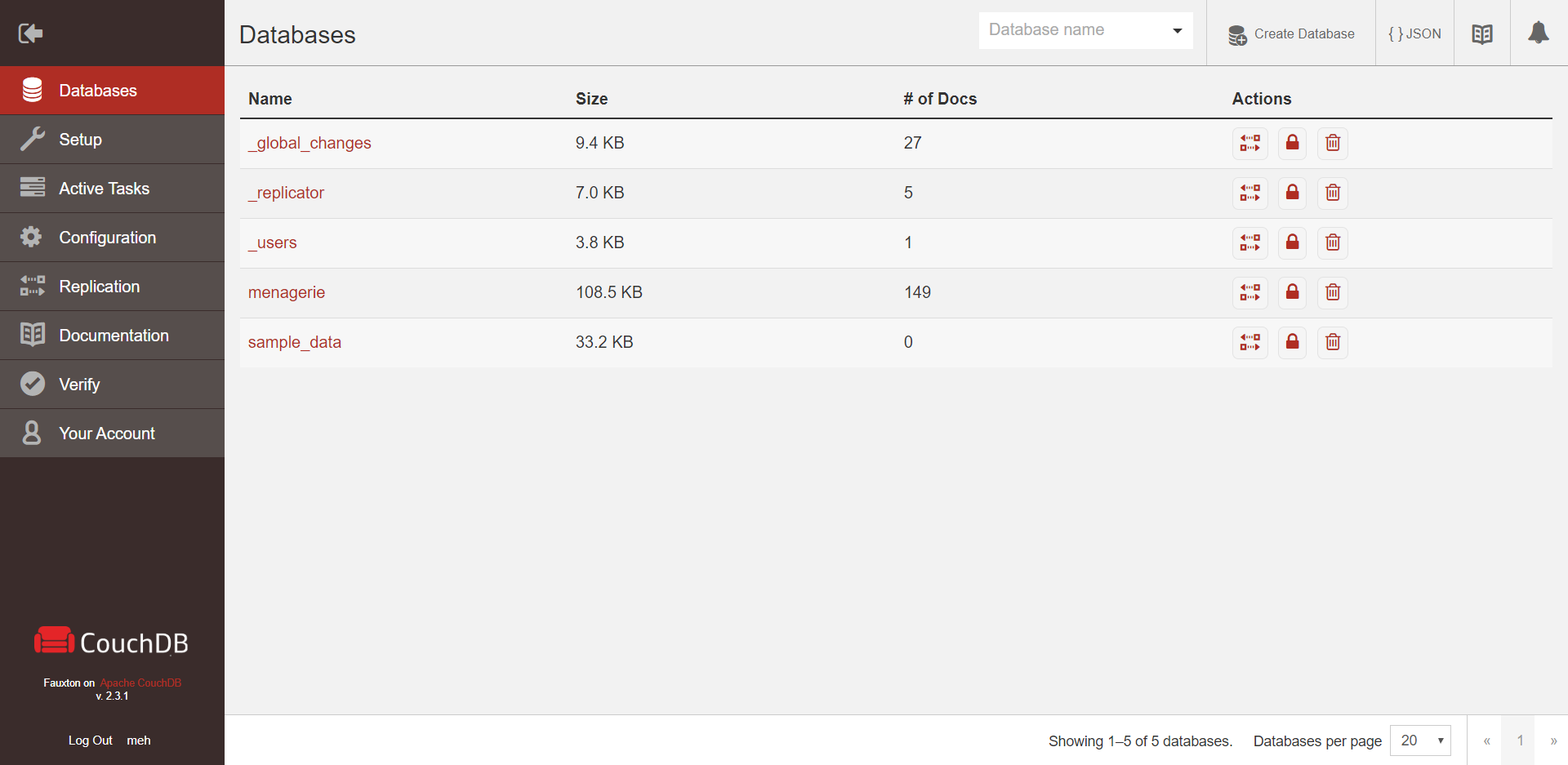
CouchDB is a mature database with plenty of features, but its GUI Fauxton (formerly named Futon) is pretty minimal. Couch’s primary interface is an HTTP API, typically used through cURL. Fauxton is built on top of this API with each page representing an equivalent endpoint. It runs as part of the server itself and is accessible by browser at <server URL>/_utils .
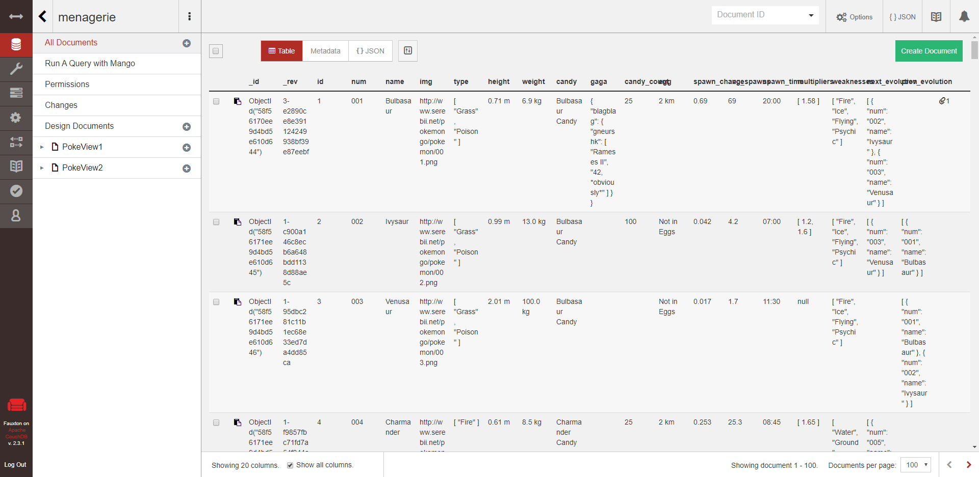
In all the databases we’re looking at, documents are written and stored as JSON. For each database, Fauxton lets you view documents either in their native JSON or as a table. In the table view, you can select "show all columns", meaning there's one column for every field found in any of the documents. Sometimes your documents all happen to have the same structure, but if there’s even a little variety, this gets impractical fast. Frustratingly, there’s no scrolling left and right, so the columns just get squished together:
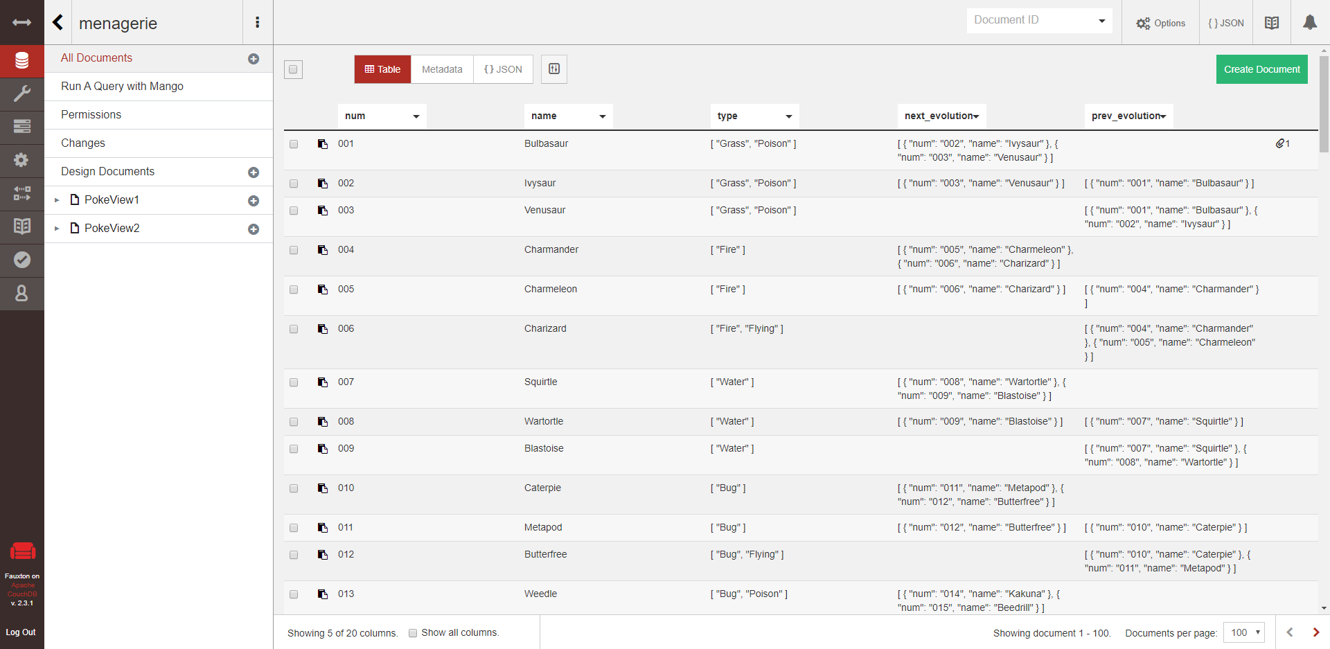
The other available option is to show exactly five columns, and choose which field each column displays. This solution might do the trick, but it’s clunky and limiting.
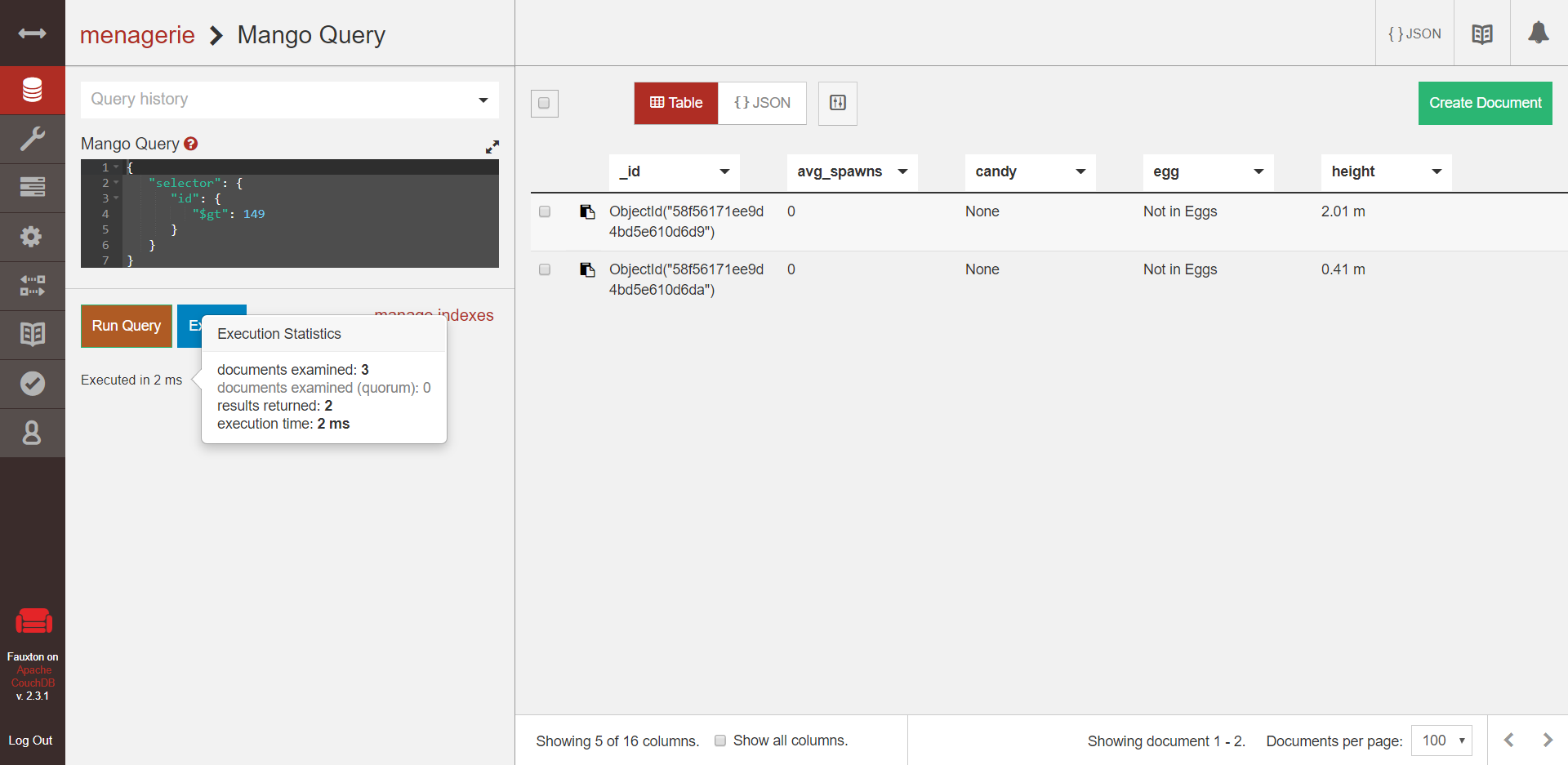
What else can you do? CouchDB's query syntax is called Mango. Fauxton lets you run queries and view the results. You can press "Explain" to view a list of stats presented as JSON, and mouse over the "executed in _ ms" text to see the duration of the query and the number of documents examined.
You can create replication tasks, which copy an entire database within or between CouchDB instances in the same cluster. And finally, there’s an "active tasks" view where you can see a list of tasks like replication, indexing, or compaction while they are running.
So, Fauxton has a few handy functions, but it’s missing many key features:
CouchDB instances can be set up as clusters when they’re first launched, but afterwards, there’s no way to connect or disconnect nodes. Fauxton also contains no list of connected nodes or their IP addresses, not even in the replication task creation menu, so keep a post-it note handy.
There’s no way to import or export data to files. Replicating data within the cluster, yes, getting it in or out of the cluster, no (except by copy-pasting).
You can see tasks when they’re active, yes, but you’d think there would be a record of completed tasks as well.
Couch’s API can give you performance stats and other useful information, but there’s no way to access any of it in Fauxton.
In short, CouchDB is a database built to be used through its API. Fauxton is a decent supplement, but it won’t let an admin get through the day without opening a shell or other tool.
As for its design, it’s janky and uninspired. I’m also sorry to report that personally when I was using it, it was very buggy. For example, I somehow lost admin access every time I went to a different page, so I constantly had to log out and log in again. Probably not normally like that, but it’s worth pointing out.
MongoDB GUIs
MongoDB’s primary interface is mongo Shell, a CLI that uses JavaScript. It’s good for most administrative tasks and one-off queries and is still one of the most common ways of working with Mongo. But it gets cumbersome as your needs get more complex, so a huge array of third-party tools have been created over the years. MongoDB released their own admin GUI, Compass, with version 3.2. Let’s look at Compass first; then, let's look at one of its most developed third-party rivals —Studio 3t.
Compass
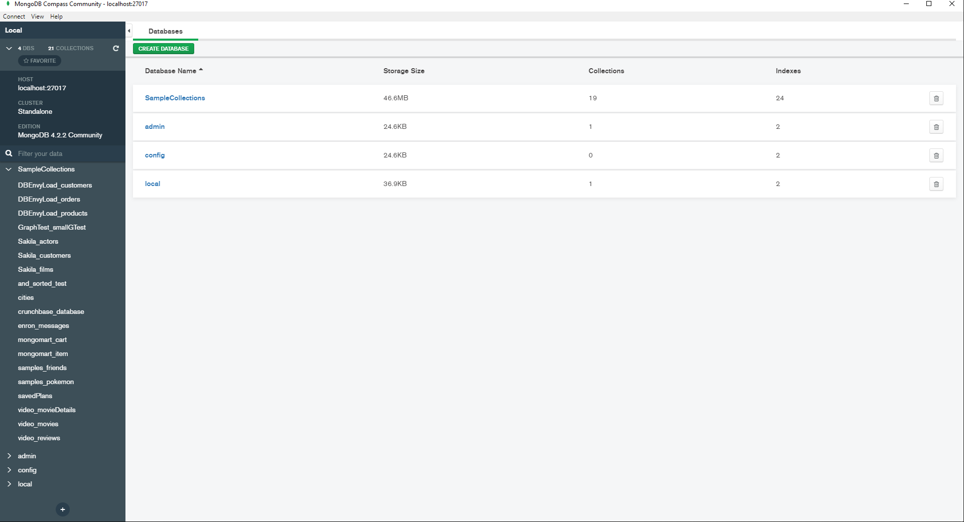
Compass is a free desktop client that connects to MongoDB and Atlas instances remotely. It offers one set of features when connecting to a Community MongoDB instance, plus a few others when connecting to an Enterprise instance.
MongoDB (and RavenDB) divide each database into collections of documents. Compass’ collection view has similar options to display documents as Fauxton: as JSON, as simplified JSON without the brackets, or in a table. The table shows all fields that appear in any document in the collection, but at least you can rearrange the columns by dragging them left and right.
Compass helps you query before you’re fluent in the syntax. The collection tab’s search bar has fields for each of the main components of the query — filtering, projecting, sorting, etc. — and it has autocomplete. Queries can then be translated to or from various programming languages and SQL.

Then there’s an aggregation tab, which allows you to create the stages in the aggregation one at a time and view a limited sample of the output of each stage.

The “Explain Plan” tab has query performance stats, namely the duration of a query and of each of its stages. This can be displayed as raw JSON, like Fauxton, but also as a helpful flowchart.
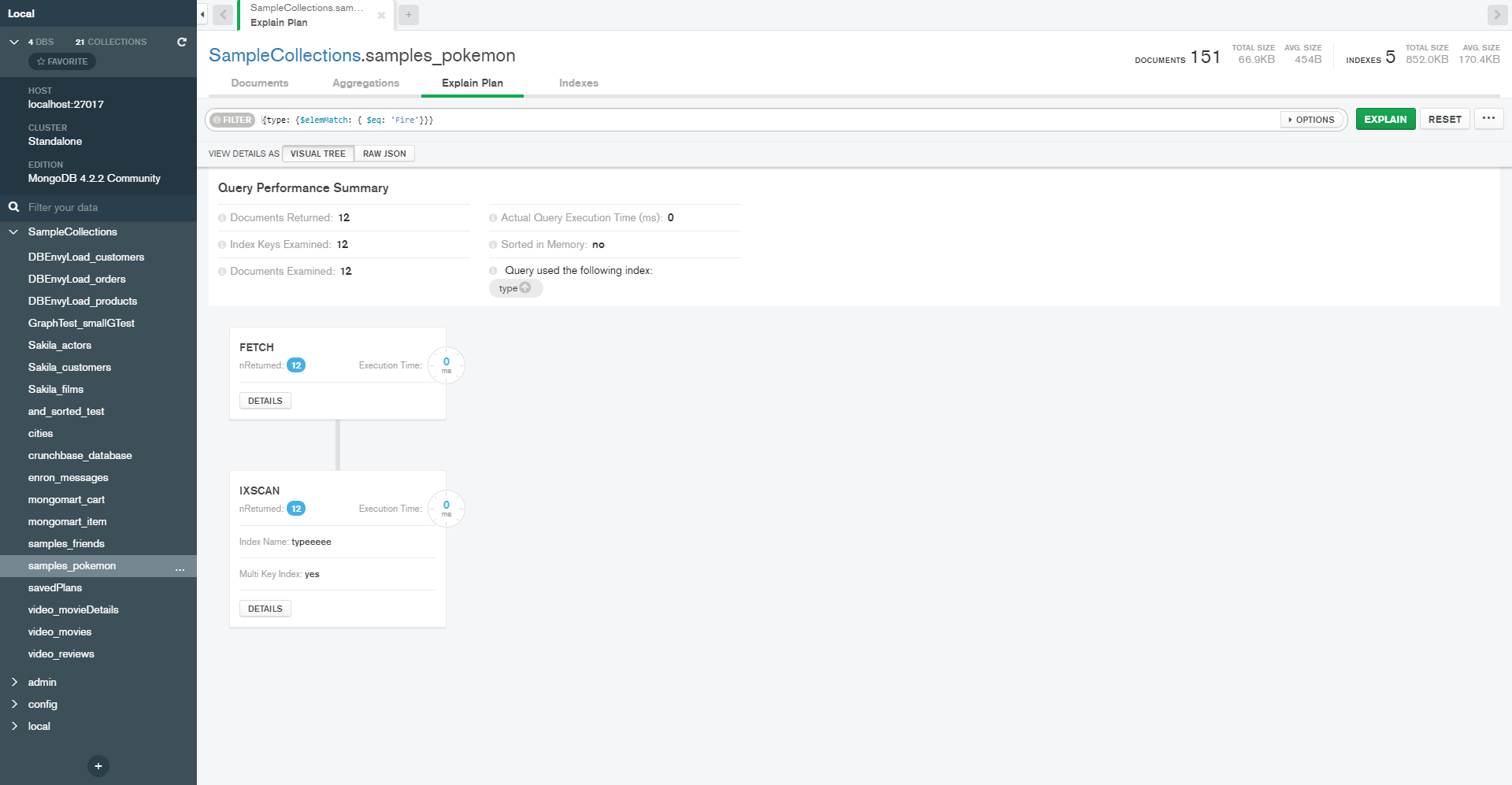
In most use cases, aggregations are simple enough that you don’t need these bells and whistles. But if you ever need to debug a more complex MapReduce pipeline, tools like these can be a lifesaver.
Unlike Fauxton, Compass lets you import/export to JSON and CSV files. You also have a list of cluster nodes.
Compass has an API for developing plugins, which is cool. I haven’t found a centralized list of existing plugins, but you’ll find some on GitHub.
Enterprise Edition Features
The additional Enterprise features include "schema analysis", which helps you get a better sense of what your data contains. For each field, histograms show how many documents have a certain field, the different types and values the field contains and their relative frequency, a timeline of when the fields were created in different documents, etc.
(MongoDB Charts is beyond the scope of this article, but it’s another desktop tool that offers more options for analyzing data.)
Compass also has a nifty interactive map for displaying geospatial data — documents that represent points with latitude and longitude values.

The enterprise version also has:
Schema validation: allows you to enforce schemas on documents, which is helpful for interfacing with relational data.
Options for authentication with LDAP, Kerberos, and X.509.
And most helpfully: a live server stats display. This includes graphs showing:
Operations per second, such as document insertion, deletion, queries, etc.
Read and write operations per second.
Network activity in kB, and in number of connections.
Memory usage.
There are also lists of the “hottest” collections and the slowest operations.

All in all, Compass has several great features, and the enterprise version is even better. Its design is pleasantly simple and sleek. It might save you the need to use the Mongo shell on slow days. However, there are many other capabilities that a GUI can and should have, as we will see.
Studio 3T
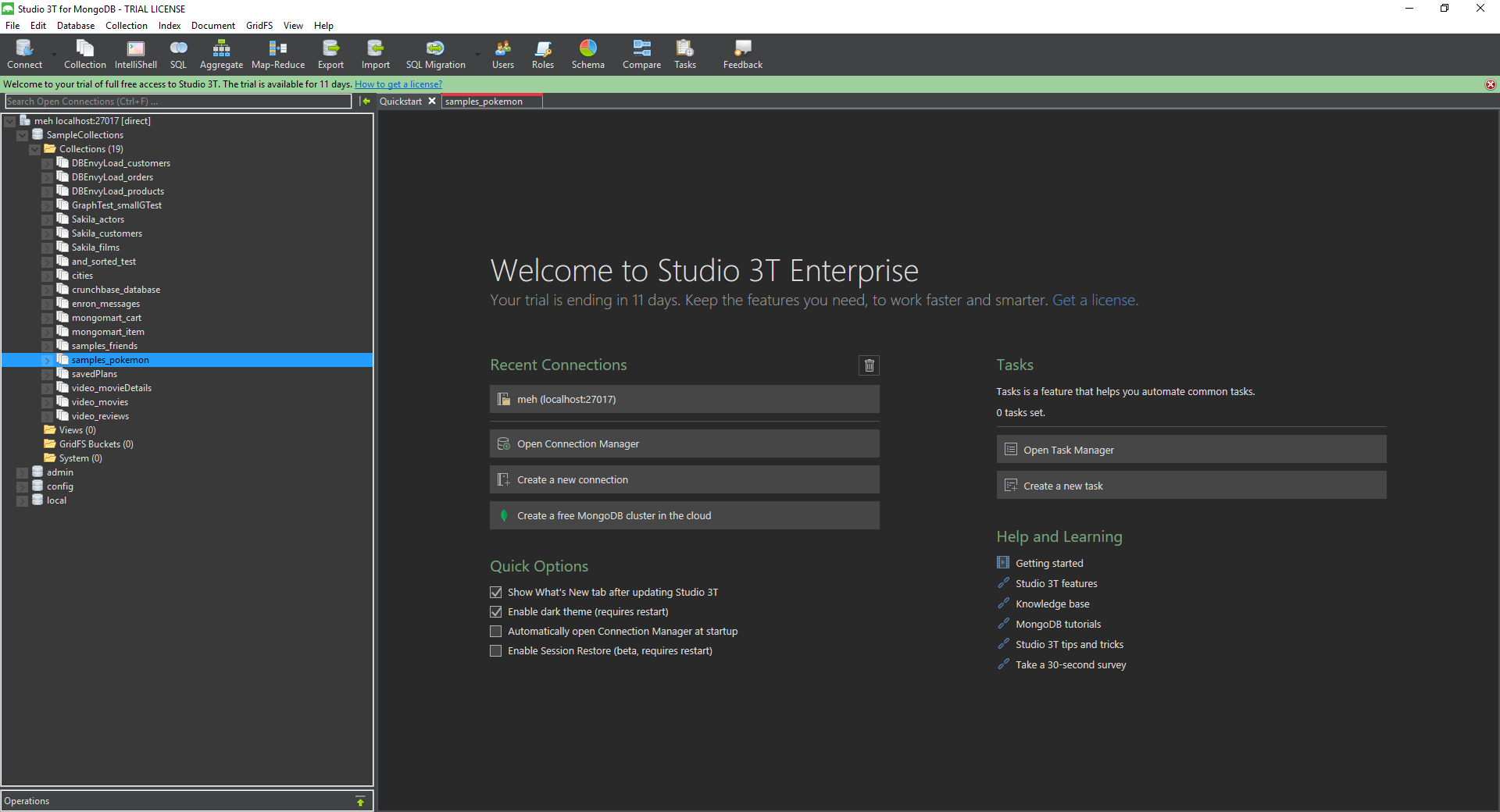
Formerly named MongoChef, this third-party tool comes in three price tiers. The cheapest is $149 a year per user, but you can check it out for a 30 day trial period.
Studio 3T is a complex beast that has most if not all of Compass’s enterprise features, plus many others. This one you really can use with no knowledge of Mongo’s query syntax. Queries and aggregations can be built “visually” by adding each component, dragging and dropping fields, and selecting operators from drop-down menus. The query explanation displays a slightly more detailed flow chart than Compass.

Once built, queries and aggregations can be translated into Mongo shell syntax and various programming languages, like in Compass. SQL is added to this list with the Pro edition (the middle price tier).
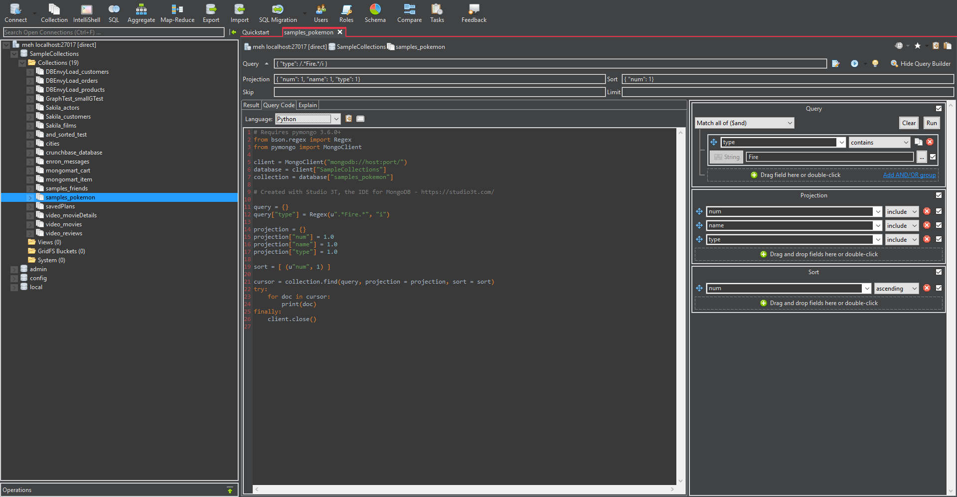
Even if you really, really can’t find an exact equivalent to your favorite Mongo shell functionality, that just means you can open the IntelliShell tab. This has a version of Mongo shell with IntelliSense, which is fully integrated with the rest of the features.

Studio 3T gives a few more options for importing and exporting than Compass, including migration to and from SQL databases. Crucially, you can save tasks like import/export, migration, and synchronizing data across a cluster. In more expensive editions you can schedule them to happen automatically as well.
Studio 3T has server stats out of the box, which are mostly similar to those in Compass’ enterprise version, maybe in slightly more detail.

Studio 3T has a busy layout that is confusing at first. I like that you have multiple tabs like a browser: a new one is created each time you view a collection, start building an aggregation, open a Mongo shell, etc. But overall, the dense grey design isn’t the most pleasant UX.
Still — what more could you ask for?
RavenDB Studio
RavenDB does have a CLI for a few admin operations. It also has a REST API like Couch’s. But it is designed from the ground up to be used primarily through the embedded GUI, and it shows. Like Fauxton, RavenDB Studio is accessed by the browser at the server’s URL. It comes with every local or RavenDB Cloud instance, and all of its features are available in the free-license editions. You can follow along on the public playground server at http://live-test.ravendb.net/ and learn more at the online documentation.
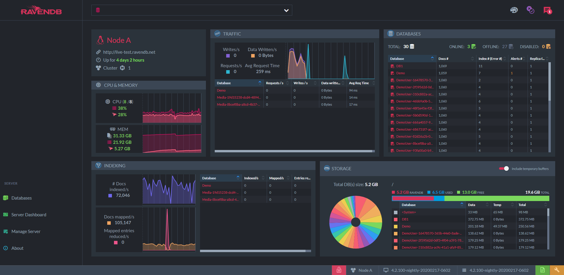
Right in the home page, you have the "server dashboard". This includes server performance graphs similar to those offered by Compass and Studio 3T: network traffic, indexing activity, CPU and memory usage, and the storage taken up by each database. But for each of these graphs, there is a dedicated interactive view with complete information in fine-grained detail. The only question is, how fine do you like your grains?
Maybe you want to know everything the storage contains? The "Storage Report" lets you drill down to every file and also gives you a visual sense of how much space each one takes with this rectangle chart.
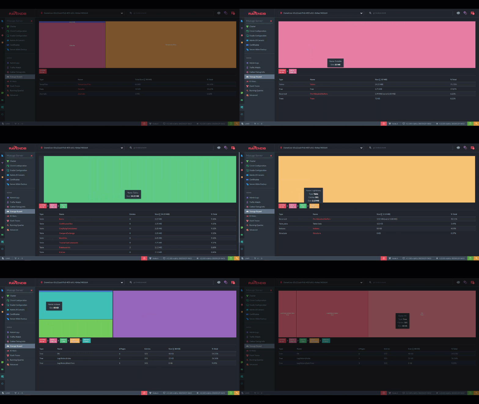
I like to quickly flip through the storage once a day, just in case. This lets me see immediately if, for example, there are more tombstones than I expected and I need to shorten the cleaning interval.
Okay, but what if you want a record of every single read/write operation on the disk? "IO Stats" gives you a color-coded timeline of every event, which you can zoom into and inspect each kilobyte and millisecond:
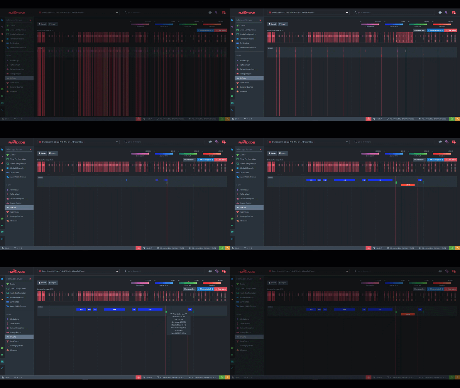
This page shows you the IO for the entire server, but each database has its own IO Stats page too. In those pages, timelines are further divided into the IO for documents vs. the indexing IO vs. the configuration IO.
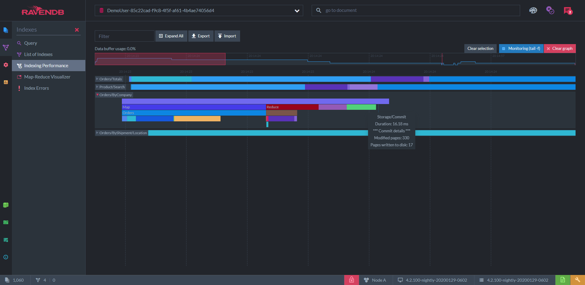
"Indexing Performance" is a similar display for all the indexing processes in a given database. Each index has a multilayered timeline to show all the concurrent processes in index creation and updating:
Clustering
One page I find especially useful is the "cluster view". On the left, there’s a list of servers in the cluster with details about each. But on the right, there’s a network diagram with each server represented by a node.
Decisions at the cluster level are moderated by one server called the leader. The leader is chosen in an election based on the raft algorithm (there’s a great visual explanation of this algorithm at raft.github.io).
When an election occurs, the graph indicates the state of the process in real-time, represented by the colors of the nodes and the connections between them.
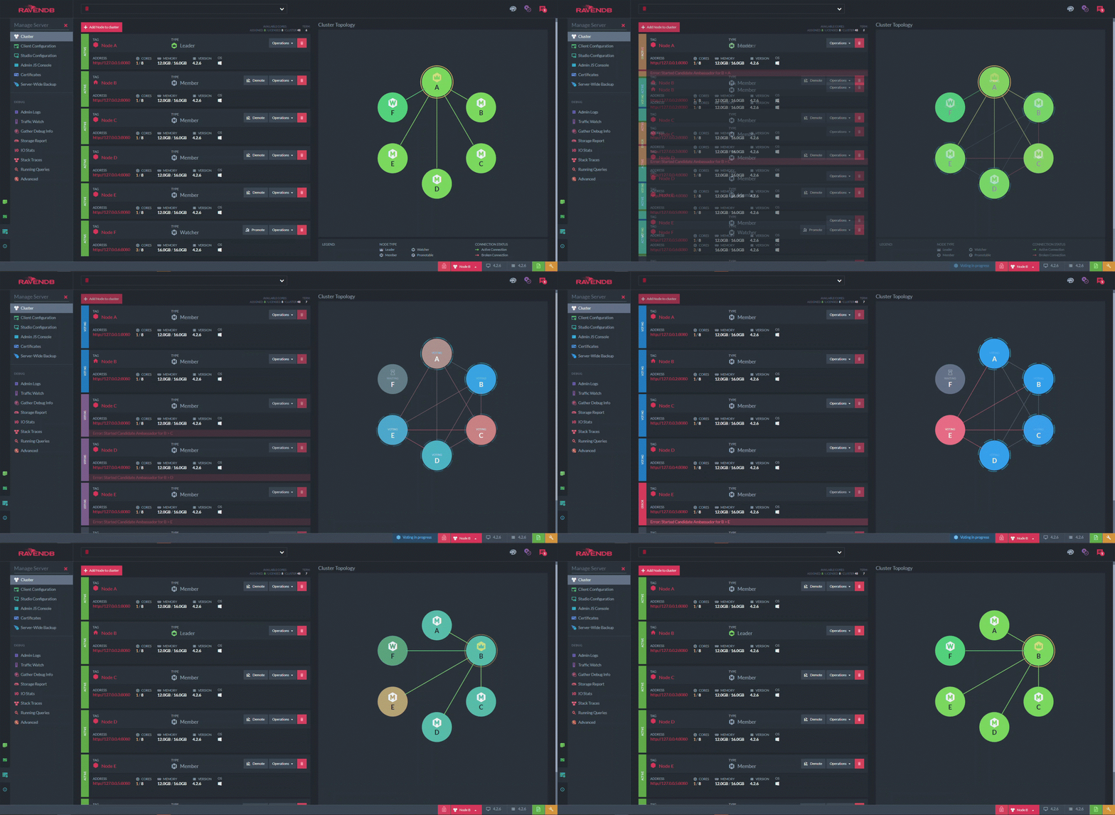
At the start of this animation, node A is the leader. Node A is manually forced to "step down", which triggers a quick round of voting in which node B is elected the new leader. (Node F is designated a non-voting “watcher”.) One look at this diagram tells you not just if your cluster is unhealthy, but exactly how and where it’s unhealthy. Additionally, it presents anything else that’s happening at the same time.
Similar to this is the "database group view", which shows the subset of the cluster that stores a specific database. Studio lets you define and schedule tasks, and this view shows the tasks assigned to each node.
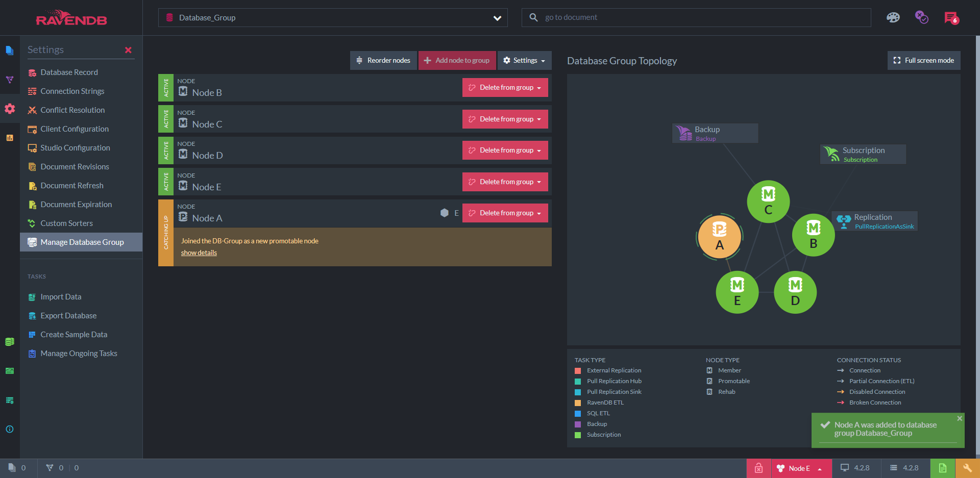
Here, we see that node C is responsible for making backups. Node B is serving clients that are "subscribed" to its data, while also receiving a replication from another RavenDB cluster. Node A has just been added to this database group and is receiving its copy of the data from node E — as indicated by the line connecting them. Node D is chilling.
Queries and Indexes
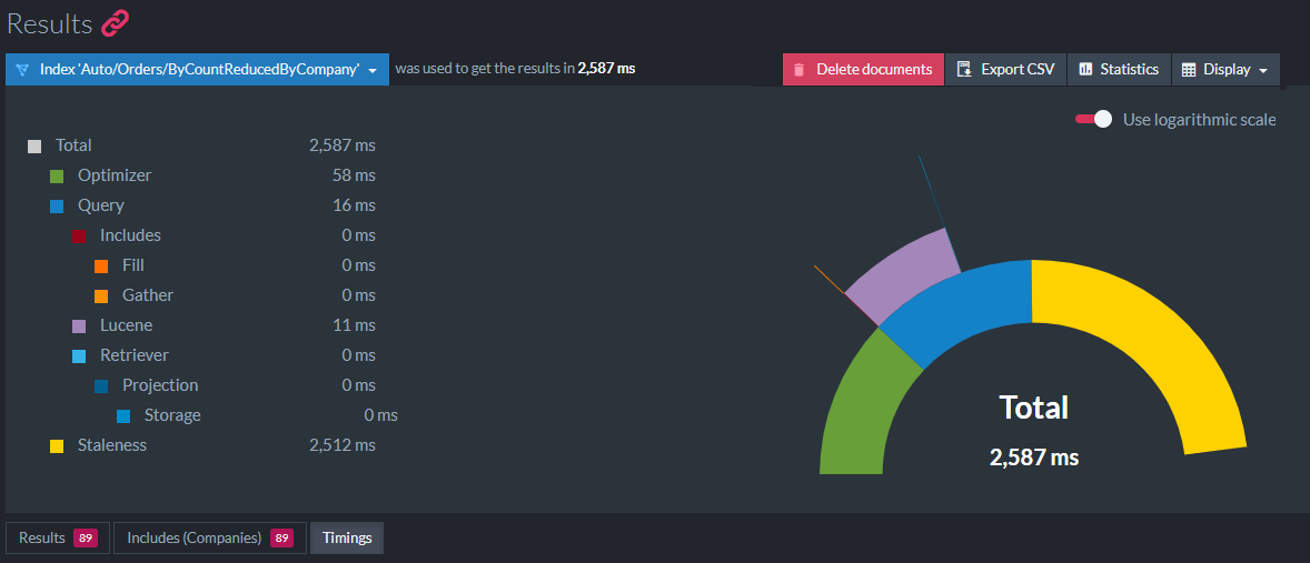
RavenDB’s query syntax is called RQL (Raven Query Language) and is very similar to SQL. The query editor provides autocomplete and displays results on the same page. If you add include timings() to your query, a "timings" tab appears at the bottom of the results. This shows a multilevel pie chart (semi-pie chart?) of the duration of each stage and substage of the query:
Indexes can be written in JavaScript or in C# LINQ with autocomplete. RavenDB also has a feature called auto-indexing: every time the server gets a query that doesn’t have an existing index to satisfy it, it doesn’t just do a full table scan and call it a day. A new index is created on the spot that will serve all future queries on the same fields. This allows you to define new indexes just by querying.
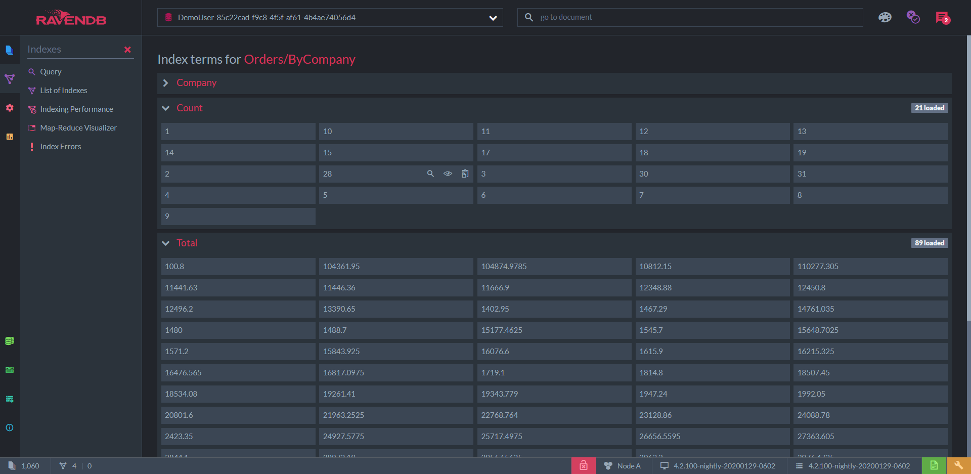
To inspect an index, Studio lets you simply view all of the indexed terms, including the results of projections and aggregations.
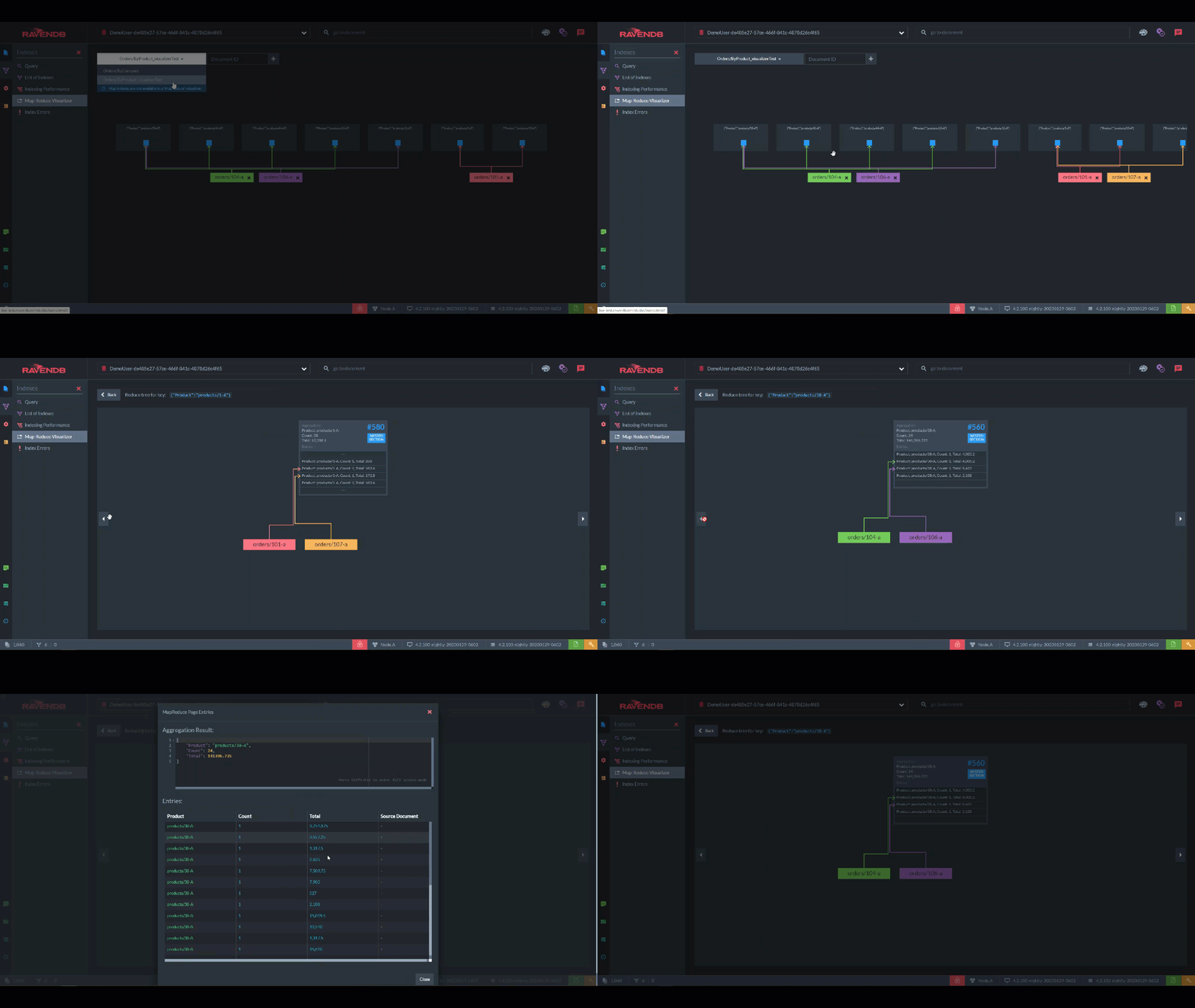
For aggregations, you have the "Map Reduce Visualizer". Here, you can select specific documents and see how they are incorporated into the aggregation with this interactive flowchart. This is perfect for breaking down a pipeline into steps and finding out where it’s broken.
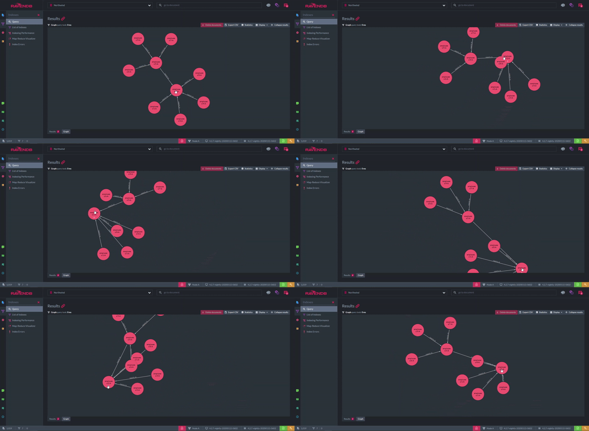
But, what if you think graphs are a better structure for your data than documents? When a graph query is performed, the results can be shown as, well, a graph. The nodes represent documents and the arrows are the relationships between them. The graph can be rearranged however you like for clarity. A disadvantage of this feature is the productivity lost from playing with it.
Displaying Documents
I haven’t forgotten about the documents themselves. You can view all the documents from a database or collection displayed in a table, like in the other GUIs. Columns can be included, excluded, and rearranged.
However, this is the only tool I’ve seen that allows you to create custom columns. These allow you to view the values hidden inside arrays and objects, whereas the table displays in the other GUIs can only show root fields. You can even use JavaScript syntax to perform calculations, combine multiple fields, etc.
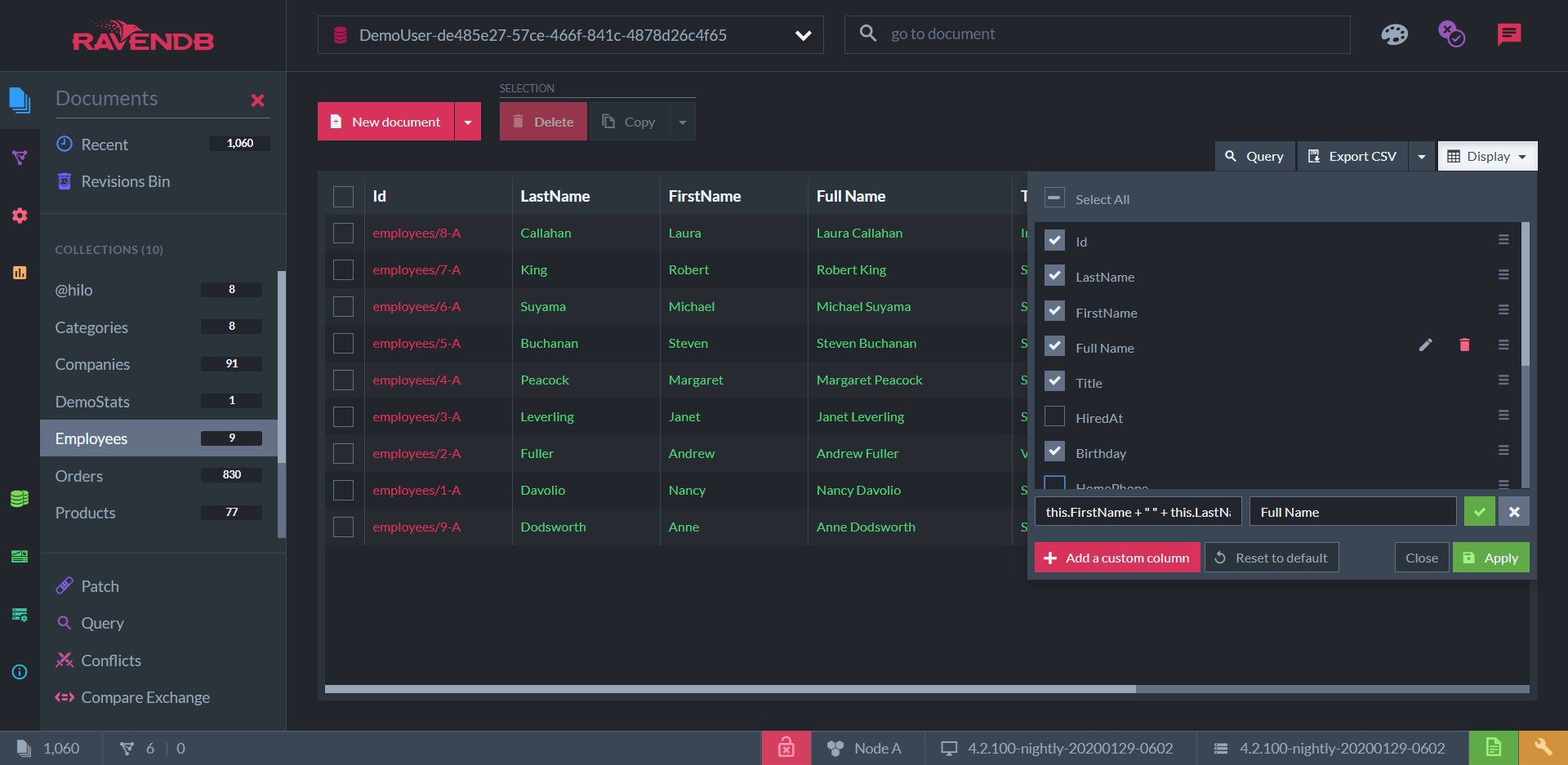
Here, I have a collection of "employee" documents with columns for the fields LastName and FirstName . But I’ve added a third column that doesn’t represent a field at all: “Full Name”, a concatenation of the first two.
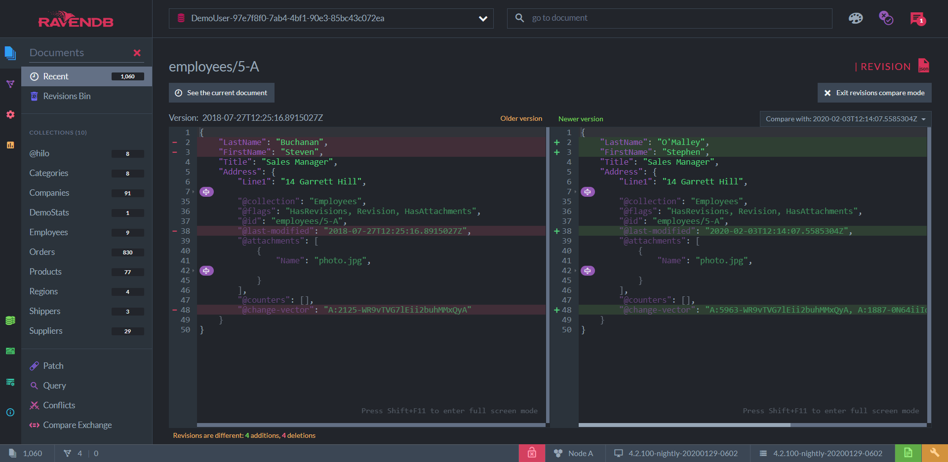
You can view and edit documents as JSON of course. Among other things, this view contains a list of past revisions of each document. Each collection can be configured to store revisions up to a given number or length of time. Documents can be reverted to any stored revision, and also be compared with a specific revision to see the differences line-by-line.
These, of course, are only the shiniest features. If you find yourself needing more information, there are also:
Real-time admin logs.
A real-time log of HTTP requests.
A real-time list of threads.
Stack traces.
Since RavenDB is fully transactional, Studio has the ability to record and replay transaction commands. If this still isn’t enough, you can always download a "debug package" for either the server or the entire cluster.
Some other handy things off the top of my head: you can import data from SQL databases. You can restore your database from backup. The query and index editors all have helpful syntax hints that teach you the basics. For the other GUIs, I had to do some googling to find large enough sample data in the right format, but in Studio you have a button to generate the classic Northwind dataset - complete with a few indexes.
In summary, to develop a production-ready application from scratch using RavenDB, you need:
Your preferred IDE for C#, Java, Node.js, Python, Ruby, C++, or Go.
A browser.
I also have to mention that Studio is really pleasant to look at. Obviously, it’s difficult to measure what effects aesthetics have on your mood and productivity, but you know them when you feel them. Studio has three color themes: dark (the one I’ve shown you), light, and blue.
Conclusion
Databases without flashy interfaces have been serving us well since the sixties, so it’s natural to continue using the same old CLIs, or settle for any database that has a basic GUI. What I hope I’ve shown in this article is that the best GUIs can save you time, add to your knowledge of the underlying system, improve your product, and give you peace of mind.
Further Reading
- When to Use (and Not to Use) MongoDB.
- An Introduction to RavenDB With Java.
- Couchbase and the Document-Oriented NoSQL Database.

