Ring Display: Building Custom ZK Components
Hello Again!
In the last two articles, we learned how to integrate a library and how to build a composite control in ZK. This time, we are looking into the creation of a custom component from the ground up. This article will cover the steps required to create a packaged component, ready to be used in any ZK application.
So, What’s Up This Time?
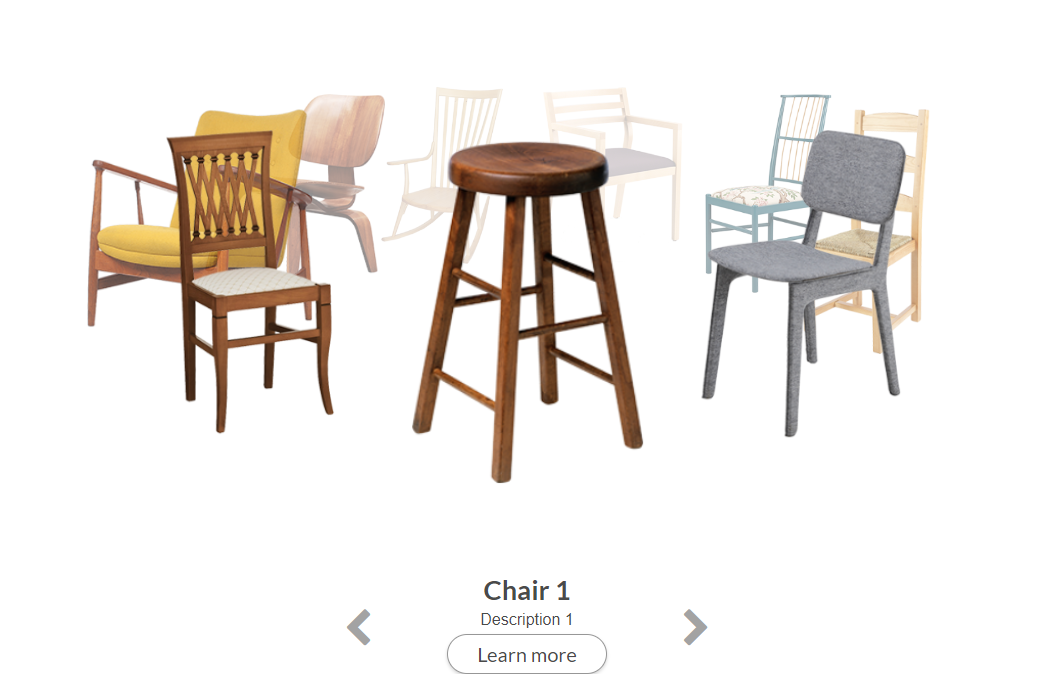
We are making a ring display. The idea is to have a rotating gallery. Imagine putting picture frames on a lazy susan. That’s the general idea.
From a top view, it will look like our content frames are moving in a circle, but they should still always face the viewer.
Got it, So Which Library Are We Integrating This Time?
Well, there are a bunch of JavaScript animation frameworks with 3D effects. But, this time, we are going to do it all with CSS and math.
Mathematics? Argh… I’m Already Getting a Headache
Settle down, it’s easy as pi.
I Hate You So Much.
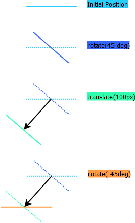
Jokes aside we are just going to calculate angles, you may even enjoy it. The first thing you need to know is that in css, we can chain transformations.
For example, let’s consider the following steps:
Rotate 45 degrees to the left.
Translate 100px in front of you.
Rotate 45 degrees to the right.
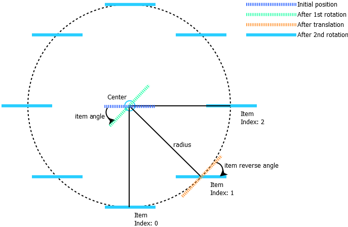
The result is that you are facing the same direction as you started, after a translation to of 100px in the direction of 45 degrees to the left. From a top-down view, it would look a little like this:
Alright, So We Are Moving Stuff Around a Bit, Then What?
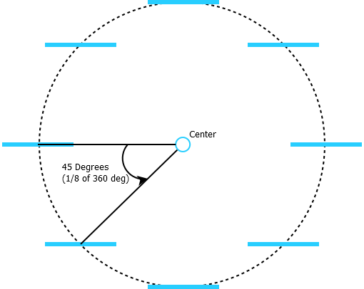
Well, if we do this with, let’s say, 8 panels, with an angle of 1/8 of the total circle between each item, they would land in a circle of radius 100px. And it would look like this:
I see… but When it Turns, We Need to Recalculate Every Angle. That’s Going to Be a Nightmare!
Not quite. We can make it simpler but just rotating the whole frame. This way, we don’t need to transform the individual panels any further. We only need to make sure they stay facing toward the user.
Alright, so let’s list the calculations required.
radius - Circle radius: This will be the translation distance from the center. Items will be moved from the center by this distance. We can either define a static value or calculate one on the fly.
nbItems - Number of Items: That one is easy.
Theta - The angle of the “slice” of the circle between two items: A full circle is 360 degrees, so theta is 360/nbItems
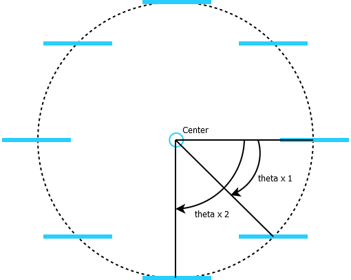
Item angles – the angle between each item position and the origin position (first item). We will use this angle to perform the first rotation, which will align the items for translation. This angle will arbitrarily be 0 degrees for the first item, since we use it as a reference. For each other item, it will be equal to theta times their index.
Frame angle – the angle between the frame starting position and its current position. It will be equal to the item angle of the item to show in the center of the view.
Item inverse angle – the angle applied to each panel after the translation to make them face the viewer. For each item, this angle is calculated as the item angle (theta * index) minus the frame angle. It will be updated each time the frame rotates when choosing a new item to display in the center.
How Are They Going to Move? What About the Animation?
What about it? We will be using CSS properties to position all these items. And you know what? The transformation property in CSS can be animated just by adding a transition. Writing the whole animation process will be done in a single line of CSS.
Alright, Code Time!
First order of business will be to test this idea in a sandbox page to make sure it works. Once we are satisfied with that, we can go on to package everything nicely.
Since we are going to make all of this into a component eventually, we can work from a zul page. It will give us access to the ZK client environment. We are going low-tech with mostly CSS, but we will still enjoy having ZK shortcuts available, as well as a jQuery JavaScript framework bundled in.
First Let's Have a Look at the Structure
We want the component itself to act as a container. Since we won’t use any advanced features, the ZK Div component is a natural choice.
We want our moving items to be containers as well. While we are prototyping with text content only, we want to be able to nest any ZK component in the final product.
ZK Div components are a good choice here. They will render as regular HTML div elements, but with hooks for ZK events and behaviors. More complicated containers such as ZK window, or panel would just add more complexity to the building process but could have been chosen for this job if we wanted their specialized features such as title, or close button.
<div sclass="frame">
	<div sclass="item">test 1</div>
	<div sclass="item">test 2</div>
	<div sclass="item">test 3</div>
	<div sclass="item">test 4</div>
    <div sclass="item">test 5</div>
	<div sclass="item">test 6</div>
	<div sclass="item">test 7</div>
	<div sclass="item">test 8</div>
</div>
That’s it? That’s Surprisingly Short.
Well yeah, did you expect a 500-line sample? We just want to make sure it works, remember?
Now that the items are ready, we just need to make them move a little. We have two cases here. First, the initial rendering. Then, repositioning the frame when one of the items is clicked.
Let’s define our objects first:
Frame: the container that we are going to rotate to make our circle turn. We are using a query selector to find it by its class name.
Items: the collection of moving items turning on our circle. We are using a query selector to find them all by their shared class name.
Let’s translate our calculations into individual JavaScript variables and functions, this will make assembly easier. For this test, we are not trying to play with dynamic width or perfect centering, this will come later. We just want to make sure our idea works.
Radius: let’s just go with a flat 500px. We will worry about resizing and dynamic size later. For now we just want to make sure the general idea is working.
nbItems: For this one, we will just count the number of objects in the items collection. This will let us add or remove children to test larger or smaller circles simply by adding or removing elements with the item class.
Theta: the slice size, as mentioned previously, will be equal to 360 degrees divided by the number of items.
selectedIndex: the index of the item to be displayed in the center of the screen. We can use this index to track the position of the circle and change it to move to a different item.
Now for the dynamic stuff.
rotateItems: we will call this method whenever the selected index changes. It will set the new rotation values for the items and the frame. We calculate the frameAngle as described above, by multiplying the current index and the theta value. We are also making this value negative to achieve a counter-clockwise numbering, which is more natural to read from the side of the circle.
In the same way, we are calculating an itemAngle for each individual item based on their index and the theta value.
With all these values, we can apply the following transformations.
On each item, starting at the center of the circle: rotate by itemAngle, move horizontally by radius, and then counter rotate by the negative of frameAngle plus itemAngle (item inverse angle).
On the frame, starting at the center of the screen: move toward the back of the view by radius (to reposition the center of the circle away from the viewing plane) and rotate by the current frameAngle based on the selected item’s angle.
var frame = document.querySelector('.frame');
var items = frame.querySelectorAll('.item');
var radius = 500;
var nbItems = items.length;
var theta = 360 / nbItems;
var selectedIndex = 0;

function rotateItems() {
  var frameAngle = theta * selectedIndex * -1;
  for ( var i=0; i < items.length; i++ ) {
    var item = items[i];
      var itemAngle = theta * i;
      item.style.transform = 'rotateY(' + itemAngle + 'deg) translateZ(' + radius + 'px) rotateY('+ ( -1 * (frameAngle + itemAngle)) +'deg)';
  }
  frame.style.transform = 'translateZ(' + -radius + 'px)  rotateY(' + frameAngle + 'deg)';}
  jq(".item").each(function(index,item){
jq(item).on('click',function(evt){
  selectedIndex = jq(item).index();
    console.log(selectedIndex);
  rotateItems();
});
});

//initialize item posisition on page load
rotateItems();
Right. Let’s Declare Some CSS. Let’s Animate This!
.frame {
transform-style: preserve-3d;
transition: transform 1s;
}

.item {
transition: transform 1s;
}
Huh... Somehow, I’m Underwhelmed.
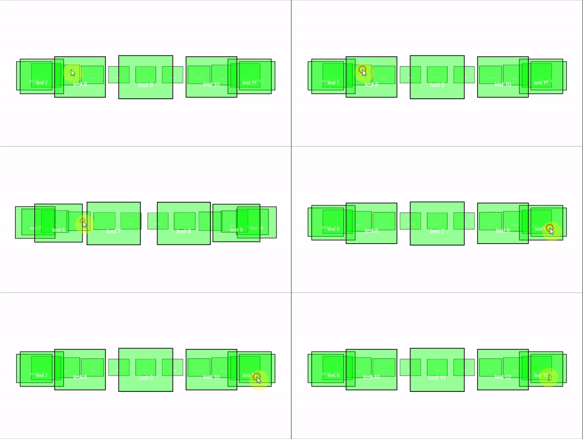
I told you so. We just tell the browser to animate the transition, and since we are not just moving the items from point to point, but rotating them, it will follow the circle path.
Also, don’t forget the transform-style: preserve-3d rule in CSS. We tell the frame that it should be the point of reference for the transformation of its children. Without it, the items would rotate relative to the page itself.
Let’s test this! Here's the full page, with a bit more CSS to make it pretty.
Ok That’s Fun and All, but We Can’t Reuse That.
You are absolutely right. We want to package it in a way that is reusable, easy to maintain, and easy to plug into any ZK application we develop.
We are using custom structures, custom styles, and custom scripts to create this effect. This would make deploying this type of script one by one horrible, so let’s package it as a component instead.
A Component?
Yes. Components are building blocks of a ZK page. The goal here is to just declare a <ringdisplay> component in your zul file, rather than include custom scripts manually, or load all our resources using script and style tags.
As a packaged component, all our resources and scripts will be stored in a jar file. We will include custom classes, component configuration files, and default options. Then, we only have to drop this package in a ZK application to start using the <ringdisplay> tag in a zul page.
Let’s Make That! What’s the Package Structure?
Well, if you've never heard of components, you can find a good primer here.
First things first. We don’t need to start from zero here. There is a maven archetype for component creation, which already contains the structure and testing tools. Have a look here if you need some details on how to use it to initialize your project.
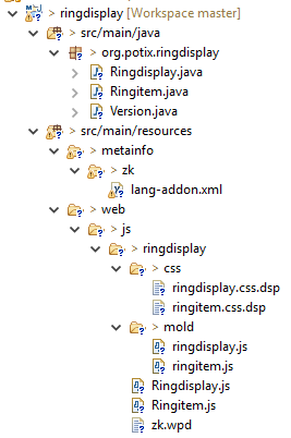
The project will initialize with a single component, but I already added the files to handle two.
Slow Down, Partner. Two Components?
Yes, the ringdisplay component will be the container, and each panel will be a separate ringitem component. We can package multiple components in the same add-on jar file, but it’s better to stay consistent. You always want granularity, so, as a rule of thumb, you can consider creating separate packages if you don’t have strong ties between every component in your project.
I will only describe the ringdisplay component files, since the ringitem follows the same structure.
So, What’s in the Archetype?
Many things. We have Java classes to represent the component on the server side, JavaScript files containing the client-side code and CSS files containing the styles.
Just Wait a Second, There Is More in There Than in Our Test!
There is a bit more. Since we are implementing the final version of the component, I thought I might as well add some quality of life features, such as infinite scrolling and optional flags for different usages. I already added the following:
Infinite scroll. The circle will use the shortest path instead of just resetting the rotation when going from the last to the first item, or from the first to the last.
Optional attributes. perspective, depth, and itemWidth can be set on the ringdisplay component to adjust these parameters on each instance.
Resizing support. The circle radius is calculated based on the width of the ringdisplay. If the size of the ringdisplay is dynamic, the circle radius will grow and shrink when the container does.
Event listening on index selection and on item click.
Click to turn: Boolean parameters to choose if clicking on an item that will make the ringdisplay turn to the item’s position or just stand still and send a click event.
Display improvements such as opacity fading in the background and item vertical centering.
API methods to call from Java. The next and previous pictures can be tied to other ZK behaviors and events.
Since we have full control over the component code, we can add or remove any feature we like!
Alright, Let’s Have a Look at the Java Classes Then.
First, the Java class for ringdisplay. It is located in src/main/java/[package name]/Ringdisplay.java. This class will provide the server-side behavior for our component. It will handle events, getters, and setters. It will also contain the private and public methods available on our ringdisplay.
So, We Must Write Every Single Behavior Ourselves? That Will Take Forever!
Not forever, but close enough that I’m not willing to do it. Fortunately for us, we can just extend a ZK component that already has defined behaviors. In this case, let’s extend a ZK div. It already has all of the container traits necessary for our component to act as such, and we will just need to add our customizations as new methods, or by overriding default methods of the Div component.
Let’s Have a Look at the Class Content.
First, we extend Div here.
...
import org.zkoss.zul.Div;

public class Ringdisplay extends Div {
...
Then, we define our internal values. Those values will be unique for each instance of the component. We can use them to store component states. Of course, if we want to use or modify them directly, we will need to give them getters and setters.
/* properties of the component.
 * Values declared here will act as default if the user doesn't specify it */
private String _perspective ="1000px";
private int _itemWidth = 200;
private String _depth = "100px";
private int _selectedIndex = 0;
private boolean _clickToTurn = true;
In the setter, we can use the smartUpdate method inherited from the ZK abstractComponent to send updates to the client engine when necessary. Since the component class is a server-side only object, these updates are the trigger to notify the client when a value has changed.
/* properties setters
 * smartUpdate() will be called to automatically propagate the value to the client
 *  if the value is not equal to the previous value */
public void setClickToTurn(boolean clickToTurn) {
	if (!Objects.equals(_clickToTurn, clickToTurn)) {
		_clickToTurn = clickToTurn;
		smartUpdate("selectedIndex", _clickToTurn);
	}
}
There is a special method called service in all ZK components. This method is invoked whenever the client sends an update to the server. It receives events and dispatches them as necessary. In our class, we override the default service to handle events specific to our new component or pass them to the super implementation otherwise.
Lastly, we define default client events listeners, which will authorize the client to send events with the declared name(s) to our component, even if we don’t manually declare them for each instance. We can declare these in a static bloc to make sure that they are executed for each new instance.
static {
	addClientEvent(Ringdisplay.class, "onItemSelect", 0);
}
What About the JavaScript Files? What Are They Good for?
Well there are two we need to write: the widget and the mold. The widget is the JavaScript client-side object mirroring the server-side Java instance of the component class. It will contain both the property values and the behavior used by the UI on the client-side. The other is the mold. Simply put, the mold is used to generate the HTML elements used in the page.
Let’s Look at the Widget.
Alright, the first thing you may notice is that the widget properties are significantly like the Java class. After all, we want to keep track of the same variables.
What’s That “$define” Business?
You mean these lines? It’s a ZK coding shortcut. Instead of writing a getter and a setter, properties declared with $define automatically generate a transparent getter, and will execute operations after the setter is invoked.
For example, this:
$define: {
  depth: function(){
    if(this.desktop) {
      updatePosition();
    }
  }
}
is equivalent to that:
getDepth(){
return this._depth;
},
setDepth(depth){
  this._depth = depth;
  if(this.desktop) {
  updatePosition();
  }
}
And the Mold?
The mold will generate the DOM elements representing our widgets in the html page. For the ring display, we want to output an outer div (fixed) and an inner div (rotating when updating the selected index).
In the mold file, you will find a single JavaScript function with an out argument. The out argument must be passed to every child of the component. They will add their output to it. We also have access to our widget instance, and therefore we can use its functions to fill in attributes as we need.
In this case, we first output the outer div.
out.push('<div ', this.domAttrs_(),'>');this.domAttrs() is a default method which will automatically fill in the class and id attributes based on our object’s properties.
Then, we add the inner div.
out.push('<div id="',uuid,'-ring" class="',zcls,'-ring">');Since this node is also part of the same object, we give it an ID based on the UUID of the main node, but with a suffix (-ring). Same for the class, which is the main class with the suffix -ring.
Finaly, we output every child of this component:
for (var w = this.firstChild; w; w = w.nextSibling)
w.redraw(out);
Then we close our tags.
out.push('</div>');
out.push('</div>');
Completed, it will look like:
out.push('<div ', this.domAttrs_(),'>');
out.push('<div id="',uuid,'-ring" class="',zcls,'-ring">');
for (var w = this.firstChild; w; w = w.nextSibling)
w.redraw(out);
out.push('</div>');
out.push('</div>');
Got That. And Now CSS? Any Difference With Regular CSS?
None. Just write CSS selectors matching our widget classes and fill in the rules. These stylesheets will be compiled into a .wcs file automatically served by ZK to the client. This ensures that our CSS rules are deployed to the page.
So, There’s Also Some XML-Looking Files…
Right on. There are two essential configuration files needed to let another ZK application use our plugin.
-/src/main/resources/web/js/ringdisplay/zk.wpd.
Zk.wpd is the package descriptor. It’s a catalog of resources that need to be bundled and served to the clients when adding our widgets to a page. If we declare a widget class in this file, the packaging process will look for the JavaScript widget file (in the same folder as the zk.wpd file), the mold file(s) in the /mold folder and the stylesheets in the /css folder. If we must load external scripts, we would declare them in here too.
In this case, we are building our widgets using only basic Div components, so we don’t need to add a dependence on other packages. If we were using classes from a different package, we would ensure that they are loaded first by adding a depends instruction to our package.
-/src/main/resources/metainfo/zk/lang-addon.xml
Lang-addon is a language definition file that defines a component set. In this case, we want to add more components to the default zul langage. We do this by declaring the language name for our addon as zul/html, which will make our ringdisplay and ringitem available in zul pages.
In lang-addon, we tell ZK which client-side widget and server-side Java class should be used when parsing a zul file containing our component.
For example, in the following snippet, we define the name to be used in a zul page, the target (Java) class to represent the component, the widget (JavaScript) class to represent the widget, the mold(s) available for this component and the stylesheets to load when this component is used.
<component>
  <component-name>ringdisplay</component-name> <!-- required -->
  <component-class>org.potix.ringdisplay.Ringdisplay</component-class> <!-- required -->
  <widget-class>ringdisplay.Ringdisplay</widget-class> <!-- required -->
  <mold>
    <mold-name>default</mold-name>
    <mold-uri>mold/ringdisplay.js</mold-uri>
    <css-uri>css/ringdisplay.css.dsp</css-uri>
  </mold>
</component>
We could also define default values or other advanced language features. For more details, see the lang-addon documentation page.
And with that, the component is complete. The only thing left is to package and use it.
Let’s Go, How Do We Put it in Our Main Application?
First, we build it. We are using maven in this project, so packaging the component is quite easy. We only need to run a maven command to generate the jar package:
mvn clean packageThe resulting package will be found under the /target/ folder as /target/ringdisplay-0.0.1.jar
And Then?
Well, you don’t need me to tell how to add a jar to a Java application. You can do everything you would do with a jar: add it to your build path, class path, or lib folder; or install it into your local maven repository and declare it in your main application’s POM file.
Let’s go with the last one. First, we run the maven install command on our component project’s POM file location:
mvn clean installThen we declare it in the main application’s POM with:
<!-- require local mvn install -->
<dependency>
  <groupId>org.potix</groupId>
  <artifactId>ringdisplay</artifactId>
  <version>0.0.1</version>
</dependency>
Install Complete! What Now?
Just use it in a zul file. I made a Step 2 page to illustrate the kind of design we could create using this component.
<ringdisplay selectedIndex="@load(vm.selectedIndex)" hflex="1" height="500px"
             itemWidth="250" perspective="1000px" depth="300px" clickToTurn="false">
  <forEach items="@load(vm.chairModel)">
    <ringitem>
    <image src='${each.imageUrl}' height="300px" />
    </ringitem>
  </forEach>
</ringdisplay>
Have a look at the full projects here:
Component project on GitHub
Prototype and demo project on GitHub
In Summary
We have seen how to use CSS to create a simple but visually interesting presentation, and how to integrate ZK behaviors and events to this display. We also went through the whole component creation process, and the critical files to use when building a ZK component from the ground up.

